I can distinctly remember my favorite font when I was in fifth grade. Are you ready? It was Curlz MT. Yes, that awful font with little curls on the edge of EVERY SINGLE LETTER. Looking back it’s a wonder that my teacher didn’t throw my book reports back at me and demand I pick something you could actually read. But alas, that just seems to be how it goes. We make bad design choices thinking they are great in the moment but on reflection wonder how in the world we could have believed it was acceptable.
On a recent trip to the bookstore with my friend, we were surprised to find so many books with ridiculously thick and shinny paper, but more importantly, we were horrified by the font choices. I love a good modern, sans serif font (just take a look at my blog title), but there is no way that I can condone the extent to which these types of fonts were used in the books we looked at. I can’t imagine trying to read a book and taking it seriously when the font is not classic.
For some blogs and websites I can understand the appeal of choosing a slightly more interesting font, as long as it can be easily read and does not come across as too out there. However, I will always be an advocate of using a classic serif font if you want your work to not be judged before it is even read.
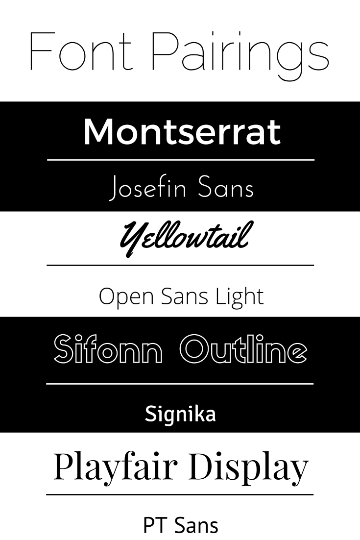
Here are my recommendations for font pairings (all of these fonts can be found on Canva):
What are your thoughts on fonts? Are they really as important as I’ve made them out to be?


Leave a Reply